
Adane Legacy

Adane Legacy
As the lead designer of this project, I used design thinking process to create an end-to-end fintech application. I also created a complete design system that is used internally to improve efficiency among designers.
Roles: User Research| Information Architecture| UX|UI design| Prototype| Testing
Tools: | Figma | InVision
The Challenge
The current fairy new Adane Legacy website lucks consistency. My tasks included:
1. Redesign the app by using existing technology to create future for Adane Legacy to attract new potential clients.
2. Create an organized design system which is user friendly for Adane legacy employees to have seamless work flow. Also should we brain storm with logo that is modern follows the brand identity? 3. Create a user friendly login and payment page.
The Solution
Using insights from research, I reworked the visual of the payment app, and focused on changing the look and feel of the dashboard on detailed guidance and supporting the action With Adane Legacy new dashboard look users can access it effortlessly. I had to come up with a solution that would be easy to adapt and have an easy send and receive invoice process.
EMPATHIZE
Market Research |Competitive Analysis |1:1 Interviews
Research Findings
Market Research
I started off by talking to PM to learn about the project. The goal was to create a new look of the payment app as well as the dashboard or the website to attract new users. It needs to be modular, to have more visual context to the dashboard.
Motivations
Convenience ( linked with bank)
Ability to make a quick payment/sending invoice /transaction
Avoid overwhelming websites
Trustworthy product
Developments
Technology innovation-(check writing option)
Live support chat, offers, FAQ
Competitive Analysis
I incorporated the detailed analysis of the competitive watch companies and their thought process and what are the methodologies they are adopting to maintain their brand image in this market. This research also goes deep through different online shopping sites and see and ask what makes them different from each other, as well as their similarity.

Primary Research
1:1 Interview
Once I had a basic understanding of the market research and whom the competitive were it was time to dive deeper into consumers' behaviors, needs, and pain points.
In order to narrow down the scope of the project, I decided to conducted a new user testing. It was important look over our matrix to see if where we are at so focused on 5 testers age group 24-55 I focused on creating a scenarios and an open-ended questions about their website experiences.
DEFINE
Personas | Empathy Maps |POV + HMW
Personas
I used my interview summaries to synthesize my findings to targeted users age group 23-55, which included professionals, fashion followers, bloggers, and small boutique owners and created user personas that will represent the targeted market for Adane Legacy.


Empathy Maps
I looked over the personals, thought about their decision making in their day to day life chooses and motivation, and created an empathy map for each


Goal
I created a Venn diagram to have a visual look before designing. These show the shared goals to make sure to meet both the need for the business and users.
Based on the primary research I also came up with a point of view statement for our users this will help to create HOW MIGHT WE questions to identify users' problems and help brainstorm for a possible solution. POV+HMW.
IDEATE
Feature Roadmap | Sitemap | Task Flow| User Flow
Feature Roadmap
After brainstorming the user goals and past experiences, I created an appropriate and possible feature map.
Sitemap
After I analyzed design patterns for other e-commerce apps, I organized and created a sitemap for users to have a familiar layout and easy to see without overwhelming users having a considerable choice of product.

Task Flow
This design system also is created to have a consistent design approach to help me see different ways a user can interact with the site and process of user’s decision making which will help me identify and focus on my design process User Flow

DESIGN
Mid-Fi wireframes | Logo | Branding| Style Tile| Hi-Fi Design | UI Kit
Sketchs
I started out with the high-level ideas and sketched Mid- Fi wireframes and digitalize using Sketch, this helped me visualize the layouts and the flow of interaction with different devices before moving forward.

BRANDING
The logo design process was based on knowing the business of Adane Legacy distinctive, appropriate, practical, and simple in form to communicate the intended message. After a few design revisions, we finalize the Logo that will represent the concept of the brand.
Style Tile
I thought simple and easy to remember LOGO, I took the actions to build a style tile on a certain image of the company. I collected tangible brand elements then create one brand image with a simple expression, a color palette that symbolized the brand and used sans-serif font for its elegant expression.
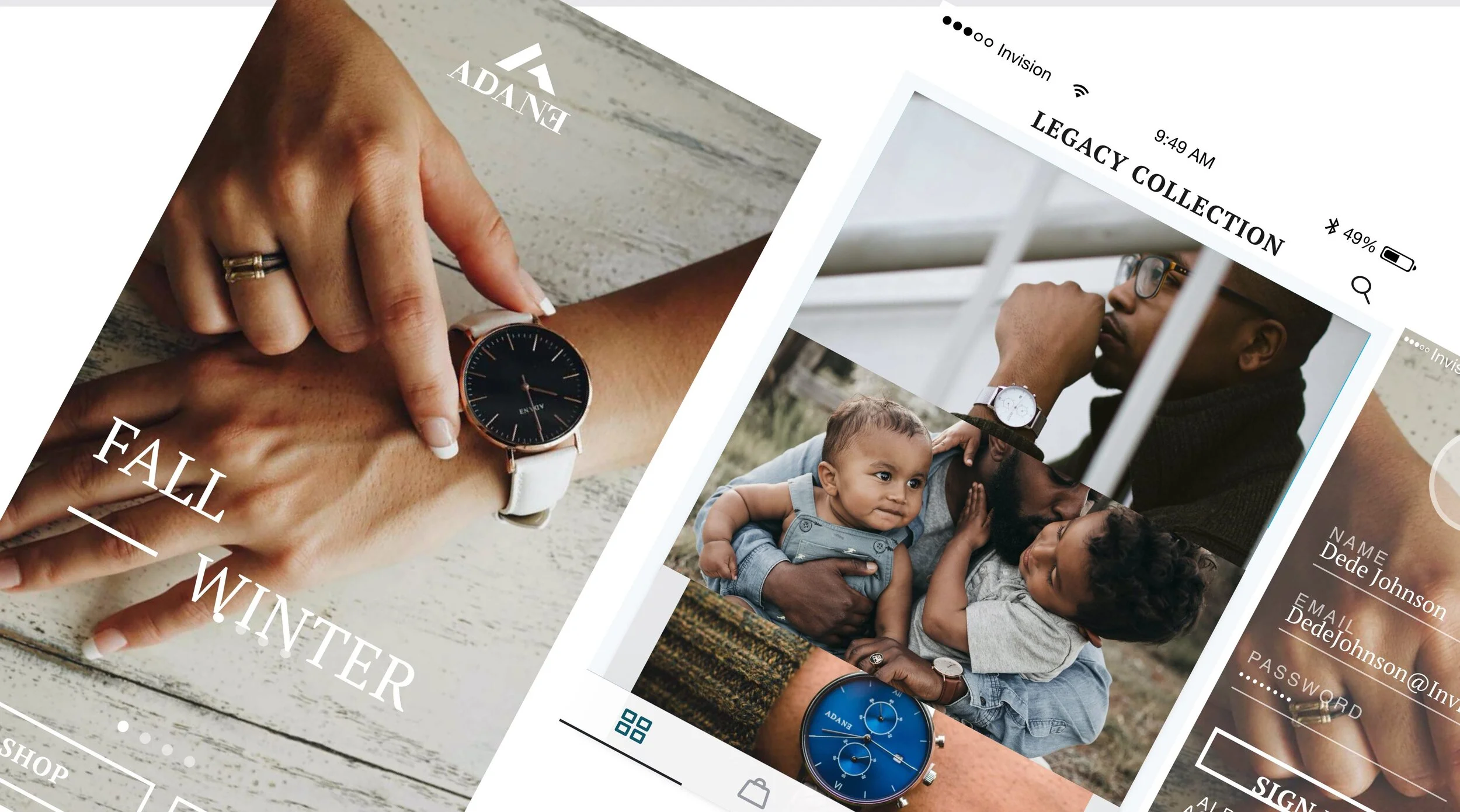
High Fidelity Design
Using my initial wireframes I transferred it into high fidelity designs. I also added quick views for faster check out, mirror view for users to experience the product trying it on, and quick and easy checkout flow


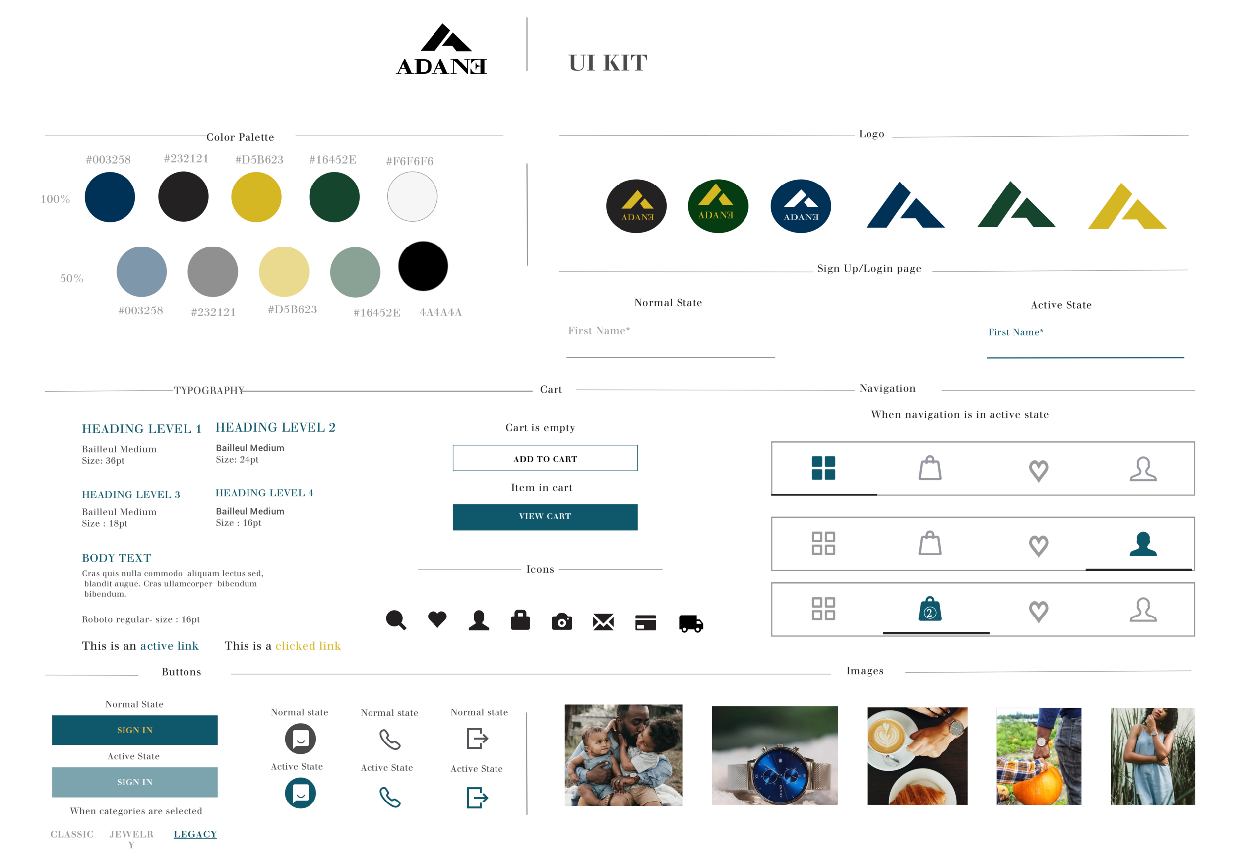
UI KIT
I organized and coordinated all of the individual elements from my prototype and proceeded to define the visual design for the app. I then used Zeplin to upload visual designs straight from Sketch and add them to project folders and hand-off.
TEST
Prototype | Usability Testing | Affinity Map
I Prototype to give a sense of what the user’s experience could be as a final product I had to prototype the high-fidelity wireframe to see the user’s interaction created using Marvel.
Prototype
Usability Test Findings
TEST OBJECTIVES and findings
The purpose of this usability test findings is to see how users interact with the prototype. Participants were given specific scenarios with the focus on exploring the app's navigation while interacting with key features and observe their experience in a quick check out process.
Affinity Map
Following users’ feedbacks helped me to identity arrays in a way that will support my recommendation in decision making I created an affinity map to better understand my observation and visualize my findings from the usability test.

Final Prototype


Conclusion
This was one of my favorite projects to work with mainly because I love anything related to fashion, and this eCommerce business allowed me to learn about the business. Though working on end to end app with a watch company had its challenge, as a designer, I realized that building an eCommerce business is a culmination of multiple small decisions and communication that has to happen while thinking of the users and being mindful of balancing what the users want but also consider how feasible the technical aspect of it as well as considering the current blueprint, mission and value of the business are essential.
Thank you for reading