Hewlett Packard Enterprise (HPE)
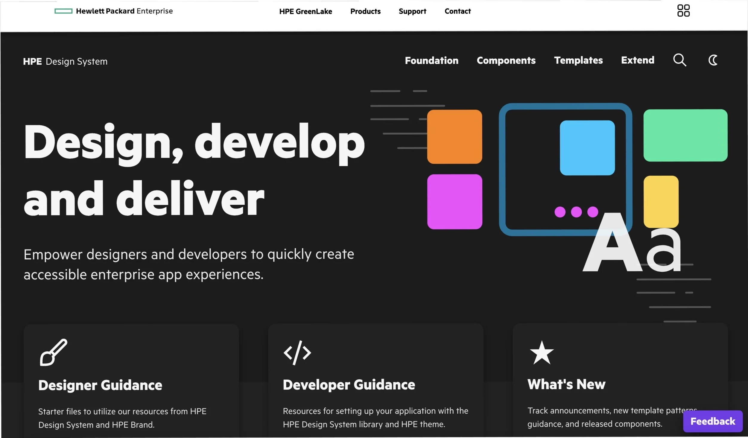
HPE design system provides a solution to our stakeholders' pain points within the organization. The goal is to create a reusable, scalable set of interface components throughout the cross-functional team to make the designers' and engineers' jobs more effortless.
Roles: | UX|UI design| Research| Testing
Tools: | Figma|
The Challenge
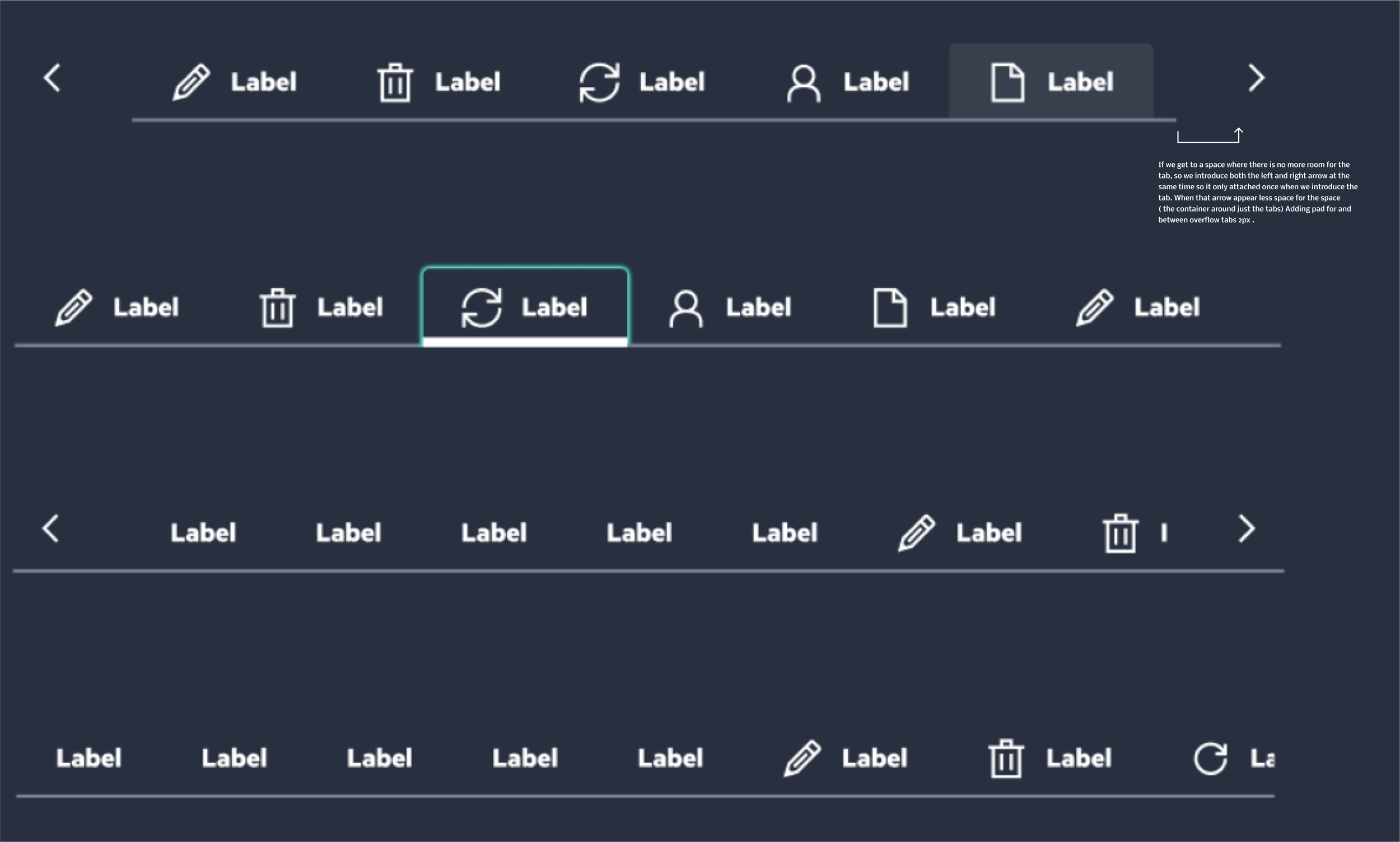
How about we find a solution for navigating tabs greater than 5? How may we design and guide our clients within HPE to handle navigating more than five tabs for specific use case scenarios?
The Solution
Exploring possible solutions for responsive tabs greater than 5 in our Navigation, how may we develop a solution that is easy to adapt and navigate our current tab component? While considering having too many tabs reduces the tappable area of each tab and might increase the complexity of the interface, educate on the importance and impact of digital accessibility and help teams meet accessibility standards for products and features.
CASE STUDY
I collected use cases from different HPE stakeholder teams and collaborated with the research team to understand their pain points better, synthesize my findings and solve them.


DESIGN
After looking over the different organization use cases and other company design system research findings, I thought about their daily product use decision-making and created a possible component solution.
IDEATE
After carefully brainstorming and reviewing with designers and developers, incorporating with the product accessibility team and A/B testing, and then sharing it with stakeholders, I addressed the technical and accessibility issues we may come across and modified and made some changes to the design accordingly to be scalability and appropriate for the brand.
HPE Site Guidance
Once we finalized the design direction, I created and analyzed design patterns to develop. With the help of our content strategist, I designed the appropriate anatomy guidance for HPE Design System Site along with our design system Figma component.


UI Component
I organized and coordinated all of the individual elements from my prototype and proceeded to define the visual design for the app. I then used Zeplin to upload visual designs straight from Figma and add them to project folders and hand-off.


